After all the blood, sweat and tears over this project, i can finally say that it is complete!! I have never worked so hard to try and fix rendering problems! From the last post i put talking about how i was happy after being able to render something after nine long hours of fixing problems. Well, that was not the last of it, it then carried on for another day. I was so disappointed when i came into university the next day to see that most of the layers had failed and the ones that had worked had images missing. To make things worse, three of the six computers we took for the night were switched off which means we lost most of the work. I badly started to worry and just did not see how we could resolve this with out having the teacher Alex to help. I thought we were going to have a play blast to hand in which would have actually made me cry (even though it shouldn't come to such lengths).
But i can happily say that James saved the day, he found something on maya which told him all the problems wrong with our piece. And we amazing had thirty one problems and he solved them all apart from three. With this solved we put the work we hadn't done on the render farm and it done it within about an hour. We did not have time to solve the other layers so we only had the colour and shadow layer working, which is better than nothing.
We went to put everything onto after effects but it could not read the file type, which i thought was rather odd, so powering through, we just went straight to premiere which meant that we could not put any special effect into our scene. With premiere working we were mainly trying to place the music in. I know we do not get marked on this but i think this really helps to capture the scene and with our friendly rat all alone, the song was pretty much perfect. We added other sound effects but we also had to leave some out. This was mainly the sound of the rat as we thought that this would crowd the music and we did not want to many diff rent noises that it would make it a little hard on the ears. We added a dissolve at the beginning of the shadow layer as we had a few images missing, so we completely took the first few out and added a dissolve where the rat looks up to the cave.
Even though we were not able to complete everything i am still pretty happy with the result. Plus with all the time and effect we put in to solve all the problems, it makes it all worth while!
Now, i have watched our final movie quite a few times and there are a lot of things that we wrong with our piece, but we did not have the time to solve any of them.
The first thing i noticed was that the camera goes through the bin which is laying on the floor. This is one of my main issues with the piece. I do not know how we did not notice this before, we done play blasts and we never saw the problem. Somehow our texture for the broken bridge spread over to other items, such as the broken glass and outer cube. I can only guess that when we were deleting some textures, we may have deleted a few too many, but how does that make this still spread to them, wouldn't they just not show a texture at all?
Due to only having two layers out of five, all the windows look black, this isn't all that much of a problem as it kind of looks as though all the lights were off.
If you notice, one of the street lamps are actually going through the fountain.....
The sound effects are a little too loud for the piece especially the creaky door.
I think there are a few more but it just shows that we had a few things to solve but for our first try, i think we done a good job.
If i were to do this project again, i would make my buildings more detailed, as Jared said before they are a little to square. I watched the Disney Pixar film UP the other day and i must say that if i had seen this before, it would have been my inspiration to have made my buildings more detailed. There was lots of detail to the main house that they could just add plan colours and it would look great, where as i have a brick texture to try and make up for it, which i have now realised is a bit of a no no. But again i am pleased that i am realising this as i go along. I would also go out for the day and do some actual sketches of buildings instead of taking pictures. This would have made me look deeper into detail and this would have shown through my drawings.
As a group i think we could have worked a little harder to try and understand what it would actually be like to be in a cave. Even though we did go to Chistlehurst caves, i did not really think to myself what it would actually be like if i were to live here for a week. I think we also needed people to speak out more instead of me doing most of it. I must say though that i really enjoyed being a team leader, it is something that i had never done before, because i was always the shy one, but i think this has been brought me out a little more. I would love to be a team leader again in the future and it made me realise to myself that i do have ideas i just need to get them out to people. I think overall our main issue was research, but we also needed to think about it deeper for it to be more meaningful.
As a team, i think we worked great. I loved the people i worked with and i would love to work with them all again. Each person had a different strength which was great, and we worked as an actual team and not just go and do our own thing without talking about it as a group first. We had many group meetings, at least two a week and was talking everyday through facebook about ideas and what people had done and what we could do to try and make it better. It was fun as well as it just being all about work. We bonded!
The only thing i would say is that Yuki needed to come in on time, most of the time she would be two hours late which would delay everyone else, and she was always the first to leave.
Apart from that i have no complaints. I want to do this project all over again. This has been the most enjoyable project i have done since being at Ravensbourne as well as been the most stressful, but i guess that is just the way things go.
Great work team S.T.A.R.S!!!
There is our final piece of work we all slaved other, and i am really pleased with the result even though it needs some work. Enjoy!
Sunday, 7 March 2010
Wednesday, 3 March 2010
The render farm
All i can say is after ten whole hours of James and i editing our work we were finally able to sort out the problems, with great delight i am now hoping for all to render nicely. This is how it all began:
James and i came in university today for 9 o'clock to get a head start on the render farm as we know that it is going to be murder trying to get our piece rendered in the last few days. But we were having big problems, our piece would not even render the very first frame, and we could not work it out for ages. The qube broke down on my laptop after the third try so we hunted around for a desktop upstairs. With this repeating over and over, it started to get rather silly. We double checked all of the names of our textures and objects. A few hours had past and we still had not figured the problem. Kofi and Keith were kind enough to try and help us out and they did notice a few things wrong, but even this was still not enough.
Alex is sadly ill so we had no teacher to try and help us out until everyone started going to Jared for different things. After a while he set up some time for the people who needed his help and when our time came i was like, finally, we should be able to sort everything out now.
Jared said a number of things it could be that we might have to change. The first thing was the lighting, followed by making all of the textures smaller, then getting ride of objects. And if none of that worked by then then we would have to check every single line to see how many verts they have as they should only have two per line.
So the hunt begin, we started off with the textures first as we did not want to get rid of any lighting as it is very important to our scene. We begin with the textures instead, we found that many of them were not even in use so that was a start. The textures for the fountain and broken bridge were a big file which had to be changed, i cant actually remember the size but i do know that they were in serous need of being made smaller. With the textures sorted we tried a render frame on maya but it would crash the programme. James and i started looking into the side of each object and was disgusted by the size of the fountain! The fountain alone was taking half of the maya size. Having that off alone cut the size of the file by half which i thought must have been wrong. We figured that the broken boulders he had in the fountain was taking all of this space. We took away around five out of seven which helped greatly but it was still not enough. Next some of the detail of the power generator at the back was removed, and i took away a lot of the flowers. They were taking a hell of a lot of space, which i never even blinked an eye at. There were so many over one another that it actually took a while to sort it out.
To our delight we were finally able to render a still frame from maya which made my day!! After all them hours of slaving away, it paid off! I have learned so much i am quite shocked. I MUST remember to check all textures and sizes of everything before i ever render anything again. I knew that the file might be fairly big but not so big that even the render farm would not be able to handle the piece. I am so glad that we stayed a long time in university to work this out. Time really does pay off, and i would hate to think what we would do if we had left and tried to figure it out the next day. We all stayed in as a team (sadly apart from Yuki) to work out the problems.
Whilst James and i were handling all of that, Ryan and Michelle had started the credits, Ryan done the opening and Michelle focused on the ending. Ryan wants to add the sound effect of a type writer as we are called S.T.A.R.S which is related to Resident Evil, and they are well known for there type writer savings.
On another subject i have found some of the sound effects which we will be needing when composating everything together. I have found a creaky door and rat sound effects which was the one main sound we needed and were having problems with, but i have found a great website called www.sounddogs.com which has pretty much everything you need.
Here is what a quick render frame looks like and i am now looking forward to what the render will look like. We are doing this is layers though, so this may take a little longer.
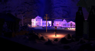 I really love how the lighting has been set for our scene. We have the blues and purples we orginally wanted but thought that having a natural street lamp would work best to show how dark a cave normally is and having a coloured light would not look natural.
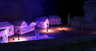
This is where the rat first appears on the bridge looking around. This is so that the audience gets a look to the most of the setting from the beginning.
James and i came in university today for 9 o'clock to get a head start on the render farm as we know that it is going to be murder trying to get our piece rendered in the last few days. But we were having big problems, our piece would not even render the very first frame, and we could not work it out for ages. The qube broke down on my laptop after the third try so we hunted around for a desktop upstairs. With this repeating over and over, it started to get rather silly. We double checked all of the names of our textures and objects. A few hours had past and we still had not figured the problem. Kofi and Keith were kind enough to try and help us out and they did notice a few things wrong, but even this was still not enough.
Alex is sadly ill so we had no teacher to try and help us out until everyone started going to Jared for different things. After a while he set up some time for the people who needed his help and when our time came i was like, finally, we should be able to sort everything out now.
Jared said a number of things it could be that we might have to change. The first thing was the lighting, followed by making all of the textures smaller, then getting ride of objects. And if none of that worked by then then we would have to check every single line to see how many verts they have as they should only have two per line.
So the hunt begin, we started off with the textures first as we did not want to get rid of any lighting as it is very important to our scene. We begin with the textures instead, we found that many of them were not even in use so that was a start. The textures for the fountain and broken bridge were a big file which had to be changed, i cant actually remember the size but i do know that they were in serous need of being made smaller. With the textures sorted we tried a render frame on maya but it would crash the programme. James and i started looking into the side of each object and was disgusted by the size of the fountain! The fountain alone was taking half of the maya size. Having that off alone cut the size of the file by half which i thought must have been wrong. We figured that the broken boulders he had in the fountain was taking all of this space. We took away around five out of seven which helped greatly but it was still not enough. Next some of the detail of the power generator at the back was removed, and i took away a lot of the flowers. They were taking a hell of a lot of space, which i never even blinked an eye at. There were so many over one another that it actually took a while to sort it out.
To our delight we were finally able to render a still frame from maya which made my day!! After all them hours of slaving away, it paid off! I have learned so much i am quite shocked. I MUST remember to check all textures and sizes of everything before i ever render anything again. I knew that the file might be fairly big but not so big that even the render farm would not be able to handle the piece. I am so glad that we stayed a long time in university to work this out. Time really does pay off, and i would hate to think what we would do if we had left and tried to figure it out the next day. We all stayed in as a team (sadly apart from Yuki) to work out the problems.
Whilst James and i were handling all of that, Ryan and Michelle had started the credits, Ryan done the opening and Michelle focused on the ending. Ryan wants to add the sound effect of a type writer as we are called S.T.A.R.S which is related to Resident Evil, and they are well known for there type writer savings.
On another subject i have found some of the sound effects which we will be needing when composating everything together. I have found a creaky door and rat sound effects which was the one main sound we needed and were having problems with, but i have found a great website called www.sounddogs.com which has pretty much everything you need.
Here is what a quick render frame looks like and i am now looking forward to what the render will look like. We are doing this is layers though, so this may take a little longer.
 I really love how the lighting has been set for our scene. We have the blues and purples we orginally wanted but thought that having a natural street lamp would work best to show how dark a cave normally is and having a coloured light would not look natural.
This is where the rat first appears on the bridge looking around. This is so that the audience gets a look to the most of the setting from the beginning.
Monday, 1 March 2010
Team Work!
Well with the last week to be able to complete everything, this is how are are getting on.
Since the modeling stages i have been helping out James with composating everything into one scene. Jared did not like the texture for our police station as it was not consistent with the other buildings, which was a big down fall for me as i thought the police station portrayed really well. At first we were all too stubborn to change this, but as the days past i thought to myself, wait a minute, Jared is our client and we should do whatever he wants to make the environment as best we can to please him and our audience.
This has made me realise that i need to listen harder to what people have to say, if i was in the real career world, i wouldn't last long if i wasn't taking in there opinions properly. Even if this means i have to change something over and over again, i need to focus on how this will make everything a success and it will all be worth it in the end.
I am now starting to animate what ever i can which is not really all that much. Everyone forgot about rigging the flowers so i am unable to animate them which was one of the things i wanted to do most. Michelle said to me though, that i would have to animate each one separately and there are over 50, so maybe i am glad about that now. Animating 50 flowers would take some time and i have other things to think about.
I am now animating the bin rolling across the cave ground as a rock falls right beside it which knocks the bin over. This makes the cave slightly spooky to think that things are still moving even though there is no one living in this environment.
I am also going to animate one of the house doors opening and slamming shut.
Michelle has worked on the camera movement so i will just need to place the animation to the camera movement and set the timing right, but this should not take long. At first Michelle had wobble movement to portray the rat scuffling across the ground but this made Jared motion sick. So that was scrapped and we now have a new one in place, which is much smoother and she has been able to place everything into the scene, which is great as this means that no ones work has gone to waste.
James has done an amazing job with the lighting!! It really makes the environment come alive and this has completely changed the setting of the place. This is just what we was looking for and i think he has done a really good job in capturing this. James has actually made me want to do some experimenting on lighting myself!
Talking of this subject, James and i were up late last night having contact through the Internet setting up the street lamps. He set them up and wanted advice on what we all thought of them but as time went on, it was getting late and only James and i were still on at about 11pm. We found that the colour of the cave was the result of how bright the lights actually were in the scene so after a few different experiments with that we found one which works nicely. We had to make the cave darker than it originally was. I was a little worried that this would take away detail from the cave itself but i was proven wrong. James has even done some animating his self by having the lights flickering. I was going to do this at first but as he was working on the lighting he took that on board too.
So we have, a bin rolling across the ground, a front door opening and slamming shut, a few rocks falling and flickering lights. I would have liked a few more but i can not really think of what else we could do.
Tuesday, 23 February 2010
Textured Police station
This is only a quick post on my police station which is now textured by our team member James. I am so pleased on how it looks, it is pretty much just how i wanted it. With our main building textured this gives me some real in site on how the rest of the buildings could look.
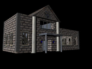 James put in a nice emblem the coat of arms which shows the building has authority.
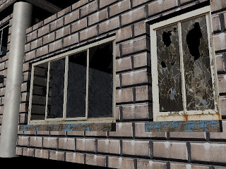 Here is some broken glass which is our main way of showing that our environment is deserted and run down. When trying to create holes and things around being broken, this was messing up the textures which was taking far to long to solve.
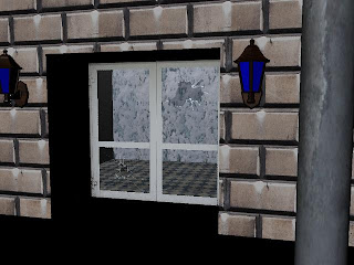
Here is where you can see through the window, James and i put some texturing inside so that you can see the inside of the building.
 James put in a nice emblem the coat of arms which shows the building has authority.
 Here is some broken glass which is our main way of showing that our environment is deserted and run down. When trying to create holes and things around being broken, this was messing up the textures which was taking far to long to solve.
Here is where you can see through the window, James and i put some texturing inside so that you can see the inside of the building.
Monday, 22 February 2010
The adventure of a rat, shall lead the way!
As you may already know our group was going to include a character into our environment, so that we had meaning for a camera going round the cave, instead of it randomly moving without any reason. Our character is meant to be of a small rat who is exploring the cave for the first time. We were mainly going to have this in first person with some camera wobbles and sniffing sound effects to give the audience the impression of a rat. We had also decided to have a scene where there would be broken glass on the floor which the rat runs up to and you would be able to see his reflection.
Now, the issue we are having due to such a short amount of time left for this project is actually modeling a rat. Jared said that if we were able to find one online we could use that, but the problem with that is firstly, we would have to pay for it, and secondly it would still need to be rigged. We came up with another idea of green screening a rat, or mouse or even a gerbil as they are all similar. But as i thought more into it the more problems i was finding. Mainly that whenever we would try to green screen it, it probably wouldn't do what we need it to do, or it will just run away and then there would be ciaos.
So, i think our only option left is still do our first person perspective with the wobbling and sniffing but just without the audience being able to see the rat at all. I think this will still be successful as we will have sound effects of a rat dueing the animation and the rat will be looking up at buildings so you will know the character is really small.
Even though this is not really what we wanted, i think this is the next best thing. I think we all got carried away with modeling our environment that we completely forgot about our character until now. And it just shows that trying to get one online is not the way to go!
Wednesday, 17 February 2010
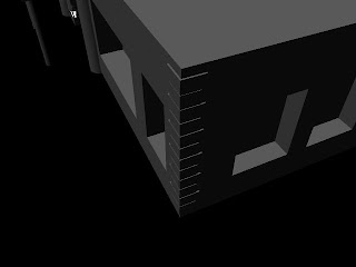
I have been putting on a little extra to my police station with the brick work to the side of the building and window ledges. Also Jared put across something to me that i hadn't really thought about. As you can tell, i have two sets of pillars, the first set being beside the main block of the building. But, the problem was that i did not really have any weight on the pillars, so what is the point of having them? So, i have made the roof of my building wider so that it s sitting nicely on the pillars to give a sense of weight. I have also done this with other set of pillars too, by making the pourch roof thicker.

Monday, 15 February 2010
Colour!!
Ok so this is a section that i forgot to include, even though my group and i have spoken about this on more than one occasion, i have not really written about it on here.
The colour theme we are thinking of using are different shades of Blues and Purples, to give a slightly gloomy and gothic effect. We do not want to portray this as a scary environment as that is not what we are going for but more of a spiritual place. We could go for more natural colours like grays and browns, but we do not want this to be to realistic like a photograph, playing around with colour could give a really nice scene of emotion.
As i am sure most of you know blue is a cold yet calm colour, many of you could relate this to water or when you are feeling sad. We want to portray this as a calm colour so with the uplifting shades of blues and purples this should give us what we need.
I have always thought of purple as a spiritual colour. As i wear dark colours myself people say that gothic colours are black and purple. You would even relate purple to magic.
Here are a few images i think are inspiring for our colour grading:
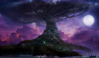 If you look at the clouds of this image, i think to myself this is exactly the type of shading i we could use for our environment. It really draws you into the image, i really think this is beautiful and if we can go on the same type of level as this, we will have ourselves a mystic cave.
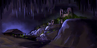 Here is a completely different type of shading, which has a lot more blues and blacks but i am drawn in to this image. This wouldn't quite fill our initial intentions but this could show a dark cave, where there has never really been any lighting for people to life in. This is something we could think about if our first hopes don't work out the way we hope.
The colour theme we are thinking of using are different shades of Blues and Purples, to give a slightly gloomy and gothic effect. We do not want to portray this as a scary environment as that is not what we are going for but more of a spiritual place. We could go for more natural colours like grays and browns, but we do not want this to be to realistic like a photograph, playing around with colour could give a really nice scene of emotion.
As i am sure most of you know blue is a cold yet calm colour, many of you could relate this to water or when you are feeling sad. We want to portray this as a calm colour so with the uplifting shades of blues and purples this should give us what we need.
I have always thought of purple as a spiritual colour. As i wear dark colours myself people say that gothic colours are black and purple. You would even relate purple to magic.
Here are a few images i think are inspiring for our colour grading:
 If you look at the clouds of this image, i think to myself this is exactly the type of shading i we could use for our environment. It really draws you into the image, i really think this is beautiful and if we can go on the same type of level as this, we will have ourselves a mystic cave.
 Here is a completely different type of shading, which has a lot more blues and blacks but i am drawn in to this image. This wouldn't quite fill our initial intentions but this could show a dark cave, where there has never really been any lighting for people to life in. This is something we could think about if our first hopes don't work out the way we hope.
Subscribe to:
Comments (Atom)


